You’ll likely notice a new look on the pages of our Fall 2017 catalog, and it’s not just because we’re ready for a new season. We’re launching our latest designer partnership with celebrated decorator Miles Redd. We sat down with the man of the hour to talk about the inspiration behind the pieces he designed for his first collection.
Ballard Designs: You can’t imagine how excited everyone is to finally share the news about our collaboration. How long has this partnership been in the works?
Miles Redd: I fell like I’ve been dating Ballard for at least three years. There was a whole interview and vetting process. Before we even started pitching ideas, I had to meet the whole team. It’s been almost two years!
But the most exciting part has been making something the public can get excited about. Being a decorator is so personal and meant to cater to only one person’s desires, so it’s a joy to design something everyone can take pleasure in.

BD: You’ve mentioned that your signature style is inspired by film, what is it about the silver screen that you love?
MR: I was a film major, so I love the movies. It’s just too much of a technical nightmare to get one made, but I get what makes an interesting frame. What makes an interesting movie isn’t so different from what makes an interesting room. I love all of the old black and white films from the 30’s, 40’s, and 50’s, like Sunset Boulevard and all the Bette Davis classics.
BD: Let’s talk about color for a second. You use it liberally in your space, but there are also heavy doses of black and white in your collection. What pieces should be grounded in neutrals, and where should we incorporate color in our rooms?
MR: Black and white are colors too, don’t forget! But I steered towards them for this collection because they’re just so versatile and can work anywhere.
For me, when you’re designing for a broader perspective, you want pieces that will work in a multitude of places, so blacks and whites were a natural fit. But there are plenty of pieces where you can add color.
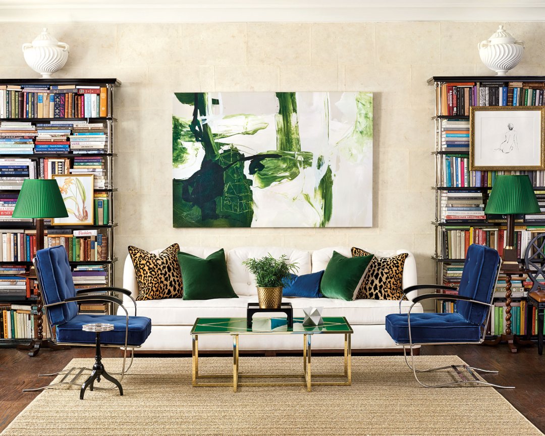
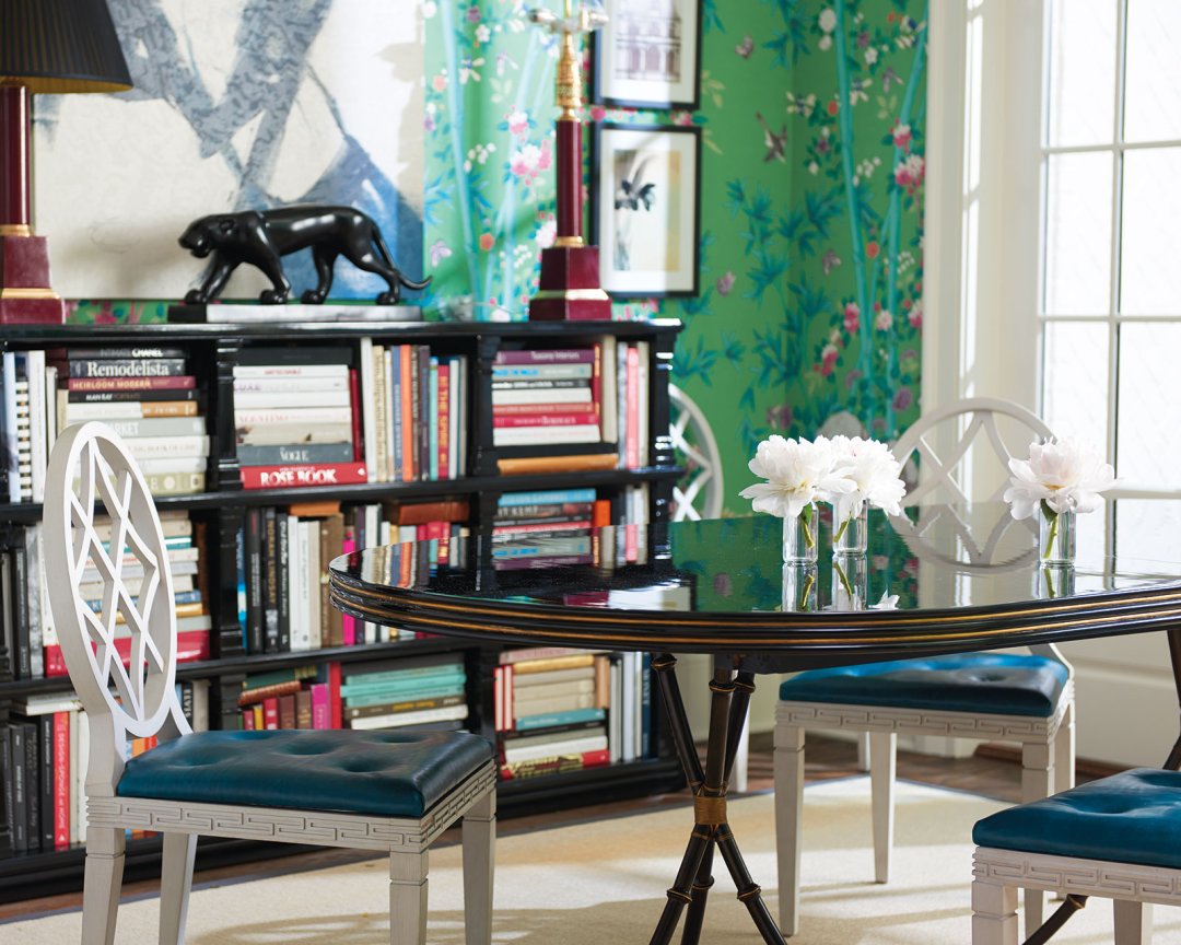
If you’re at all afraid of color, start with pillows and lampshades which allow you to introduce color without jumping into the deep end. You’ll be surprised how those small pieces can brighten up your life. Have you ever seen those black and white movies that will suddenly fade into color, and things just get so much more exciting? If you’re color curious, test the waters with some emerald green lampshades which will do wonders for a room that’s mostly neutral. That’s just what we’ve done for the living room in the catalog!
BD: Talk to us about the shape of this low slung Samuel Sofa?
MR: There are a lot of boxes a sofa needs to check before I’m happy with it, and I’ve been slowly refining this shape over the years for my clients. First of all, I like something that when you sit in it, doesn’t look like an unmade bed. I also like a contemporary silhouette that can work with traditional things, and of course, every sofa needs to put comfort above everything else. I wanted three people to be able to sit comfortably and for a tall man to stretch out and take a nap. All of those little requirements contributed to the style. The half arm feels great to tuck into it without feeling overpowered, and the button detail is a nod to 19th century upholstery. It takes what is essentially a modern shape and gives it a little historical reference.
BD: In the living room you designed, you’ve got your low slung Samuel Sofa right in between two very tall black lacquer and silver bookcases. What’s so magical about these scales and shapes together?
MR: I love different proportions in a room. You want something tall and something low. When you have something tall, it accentuates the height of the room and makes it feel bigger. When you have something low, you’re sort of down low looking up making the room feel larger again. It’s a great decorating trick that I use all the time.
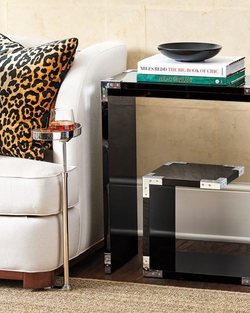
BD: There are lots of little tables in the collection – the Greek Key Side Table, Marquetry Table, the Silver Drinks Table, and the Kidney Accent Table. Do you have a favorite and how do all of these pieces fit together?
MR: I love small tables around the living room because they’re functional and comfortable. They can also be hard to find. My favorite is the Kidney Table. It’s so useful and so unobtrusive. You may not have enough space for an end table in every room, but you can always tuck in one of these.
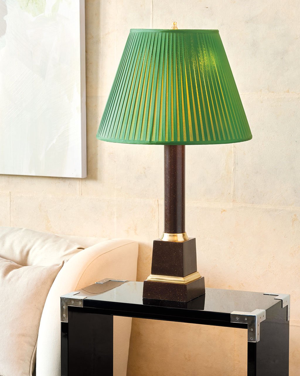
BD: Lampshades are a carefully considered element in all of your spaces, and the shade on your Column Table Lamp is as important to the design as the base. Why does this shade work?
MR: You know, a billiard green lampshade goes anywhere. I learned that from the great country houses of England. It’s a way of infusing color without committing to an entirely green room. When it’s lit, it glows and feels rich and sparkling. I wanted to bring that to the Ballard customer because she’d understand that and appreciate it.
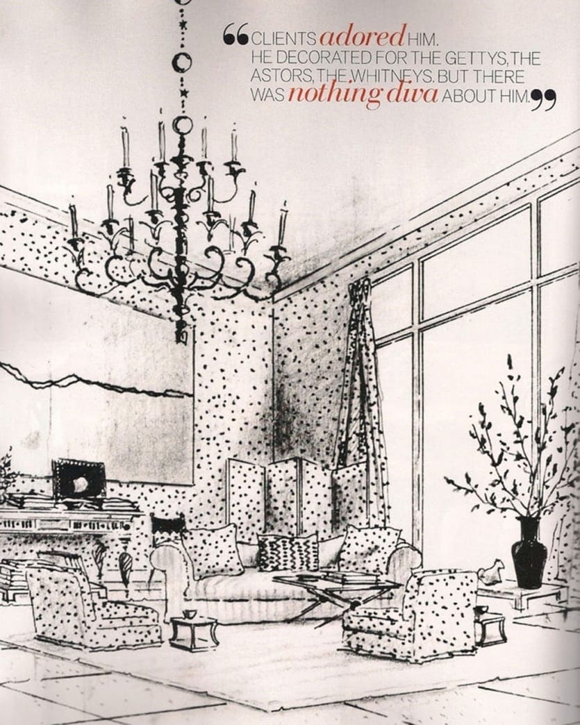
- A sketch by legendary designer Albert Hadley
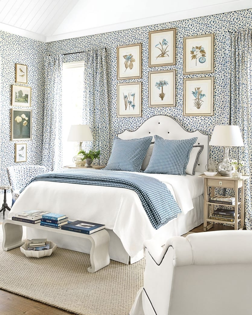
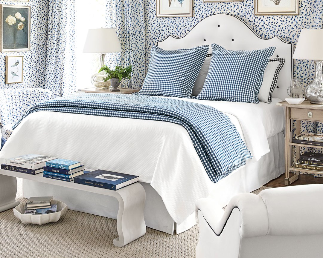
BD: You’ve done this in the bedroom you designed for your debut collection. Most of the pieces in the room are white, but the walls, drapery, and fabrics are this great blue and white print. Tell us about the inspiration for this space.
MR: When we were decorating the rooms for the catalog, the first thing I thought about was the background. As a decorator, I’m always focused on having an interesting background for furniture, and in this case, I knew the headboard and chest would both be black and white. I wanted to inject this strong background into the space to make those solid pieces stand out.
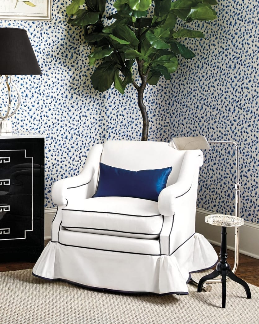
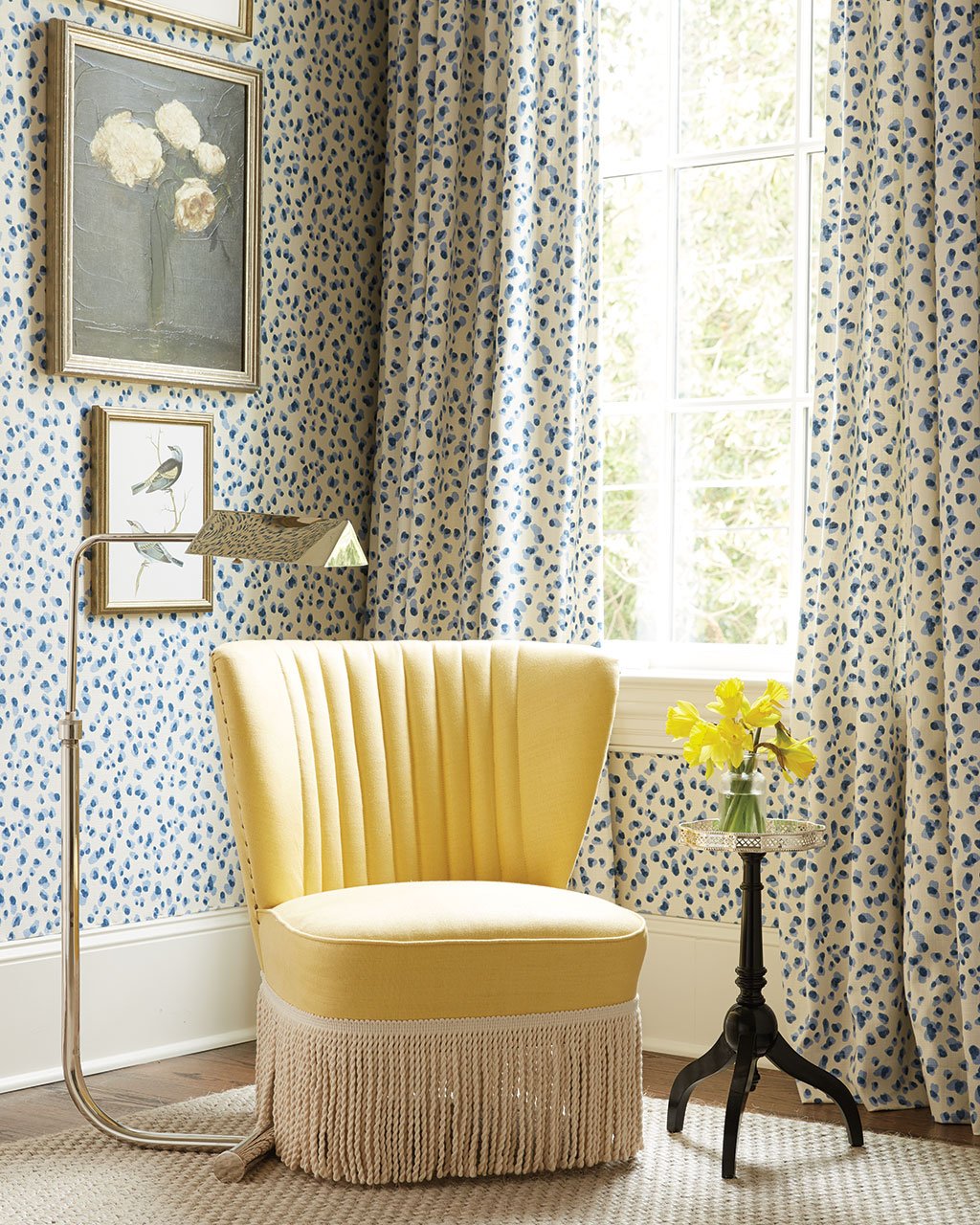
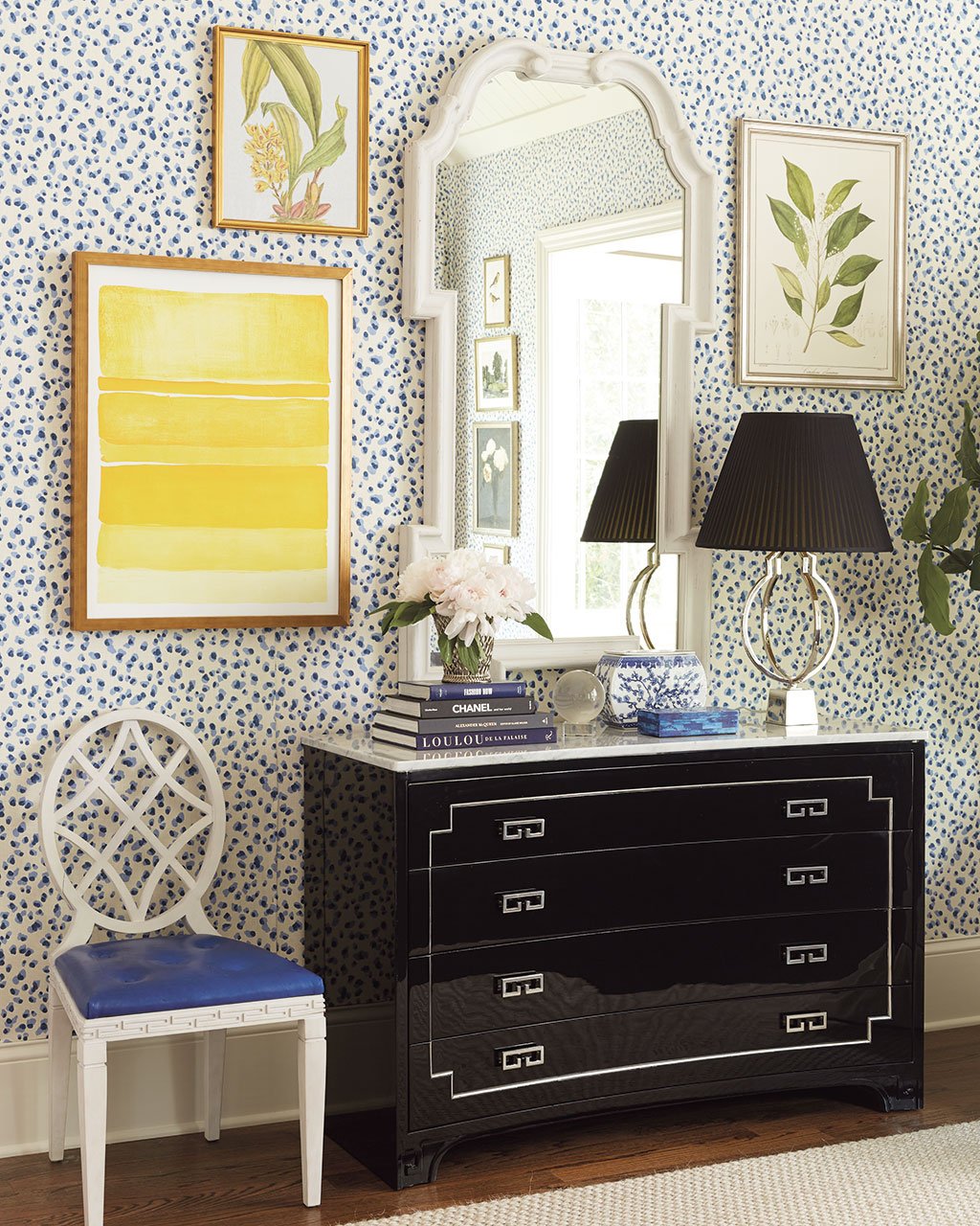
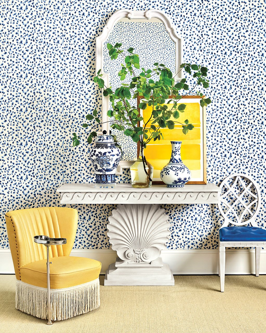
There’s a famous Atlanta decorator named Dottie Travis of Travis & Company who influenced me so much. I was friends with her daughter Emily, so I’d find myself at her house from time to time. Dottie had this funny little room, and she had done everything in a tiny, gray leopard. It was basically a dot. I remember walking in and seeing how she’d used it everywhere, and it was just so chic. Having seen a space like this, I knew that if we hung the Mira Blue dot fabric like a wallpaper, it would tie the whole room together in an unusual and flattering way. Oddly enough, the pattern disappears. It fades almost like leaves on a tree.
I’m always inspired by the greats, and if you look at Albert Hadley’s book of sketches, he’d always draw dots on the wall, just like Dottie Travis’s leopard print room. His sketches are so loose but even in the drawing, the graphicness of dots creates a great backdrop.
BD: I love the way you’ve used your Waterfall Bench at the foot of the bed. Does every bed need something here?
MR: I don’t know about you, but I always have a stack of books and magazines cluttering up my bed. I love to read in bed, and having a bench there will give you a place to deposit said books. It anchors the bed, almost like a footboard would. I know lots of people don’t love footboards because they’re tall, but every bed needs a little footnote. A bench is a great way to do that.
BD: Your Mitford Bedside Table is a petite scale with an elegant shape. Should we assume you like an uncluttered nightstand?
MR: We wanted to make things that were both apartment-friendly and house-friendly. I find that you can get everything you need from a small bedside table. It’s big enough for a lamp, a glass of water, a flower, and plenty of book and magazine storage with the two shelves. It’s efficient and get’s a lot done. Bedrooms without bedside tables are tedious. You have to have somewhere to put things! So we designed the Mitford table with that in mind.
We actually shot this room in a very large house that had plenty of room, but even there, the little nightstands don’t feel dinky. They hold their own.
BD: Of course we have to talk about your Channeled Slippered Chair. It has the most unusual shape and scale, but it’s that scale that makes it able to squeeze into just about any room. Where did you inspiration for this piece come from?
MR: I’m a chair addict. I love little, low chairs and also big, tall chairs. Both are almost like sculptures, but low chairs are surprisingly comfortable. When people sit in them, there’s a humanness to them. You’re close to the ground, so the conversation feels intimate. I found the original at an antique barn many moons ago. What I love about it is that it feels so 1930’s English, like Claridge’s. I can see Nancy Mitford or Diana Cooper posing in one of those in front of a fireplace. I love it’s slinky, curvy lines and that deco-y, streamlined silhouette. The Channeled Slipper Chair is a direct copy of that one I found — it was perfect the first time!
In this space, I chose it in a buttercup yellow because to me, all primary colors always go together. I find myself always going back to some variation of primary colors. I love the feeling of having an entire room that’s blue and white, and you throw one off thing into it. There’s perfection in imperfection. That different color throws it off and adds more personality. I did use yellow, but I also strategically used bright green branches in the space.
BD: This bedroom is such a light and airy space, but your Tuxedo chest brings this little hit of drama. How do you know when your space needs that anchor piece?
MR: It’s a yin and yang thing. The headboard is black with white welt, and the chest is black with nickel hardware and a marble top. As a decorator, you’re always striving to find things that balance the room. My secret is that black and white work anywhere, especially if you have a colorful wall. The Tuxedo Chest would work on a pale blue wall, a yellow wall. All this chest needs is color! I think that’s my favorite thing about this collection. The pieces are strong enough that all you’ve got to do is add a little color, and it works perfectly. Paint your walls a bold, add in pieces from this collection, and you’ll be great.
BD: The detailing on your dresser is really gorgeous. How did you dream this piece up?
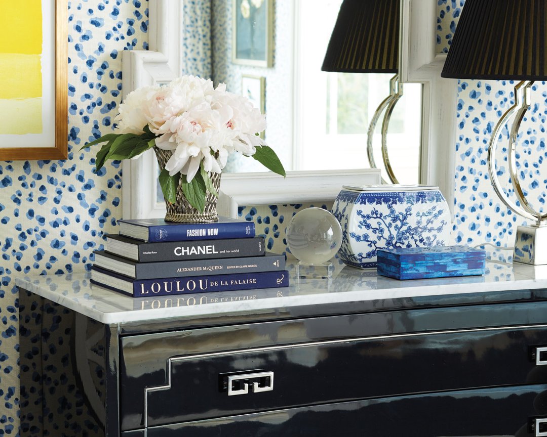
MR: You know, I found this unusually shaped dresser, but I changed the hardware and added the white marble. Originally, it was in a golden oak color, but I ebonized it to be black. If you’d seen it in it’s original state, you wouldn’t have liked it. It was the curved line that made me bring it home because it allows you to lean into it. It’s amazing what that convex curve does for a dresser.
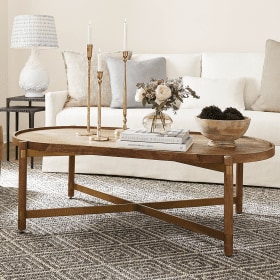
BD: Diamonds and x-shapes are a recurring theme throughout the collection — on chair backs, your coffee table, the legs of your dining table. Why does this shape appeal to you so much?
MR: I guess it’s just the graphic line of the ‘X’ and the diamond. The checkerboard is the ultimate graphic pattern.
BD: We can’t forget to talk about your Shell Console. You have the original in your home, why did you want to make it a part of your first collection?
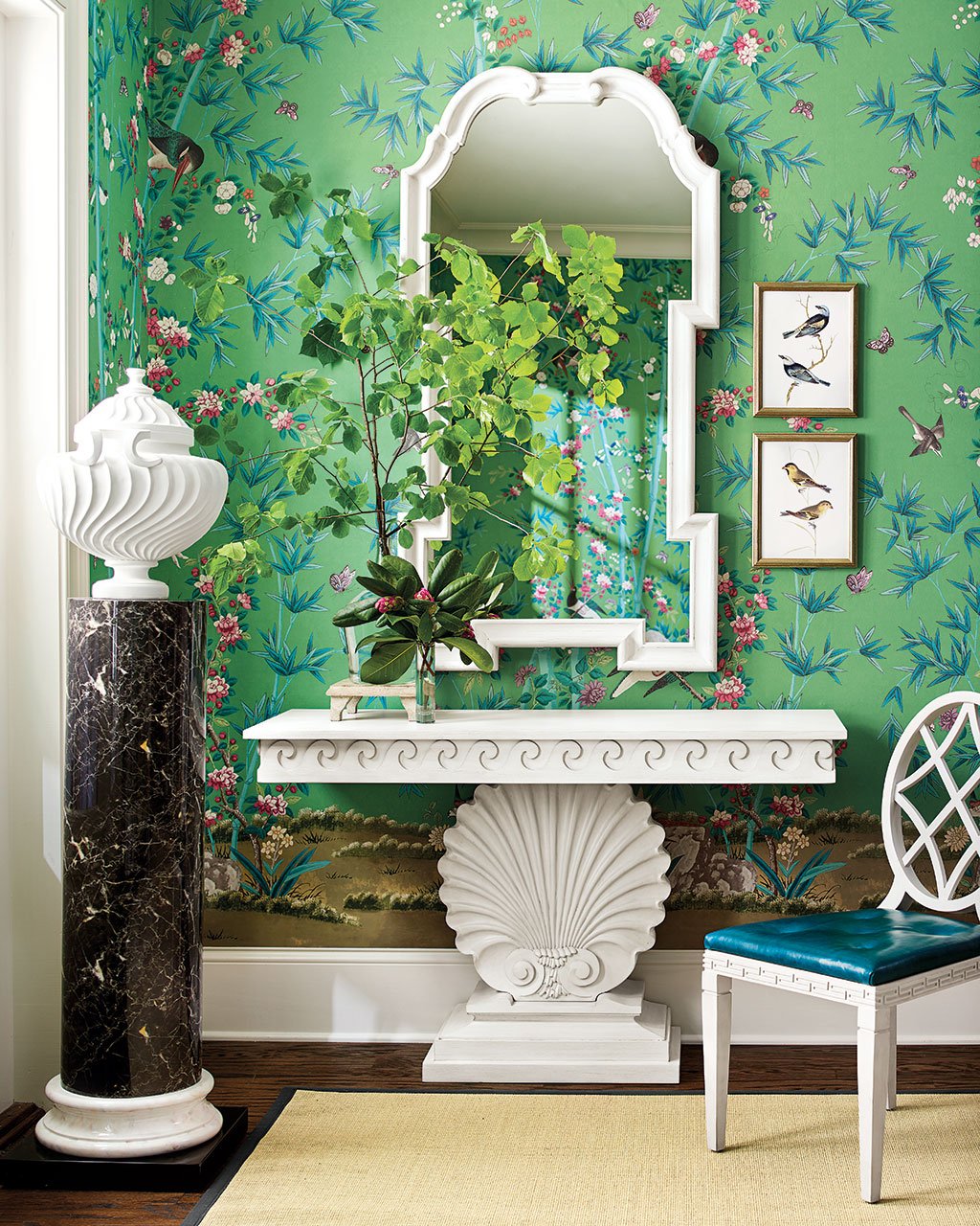
MR: I bought the original at an auction years ago, and we did tweak it a bit for the collection. Mine is actually quiet small for a narrow hallway, so we blew the scale up to almost three times the original. Mine is in a bleached pine, but I like the chalky white better. I’m a pisces, so I love a shell motif and a wave motif. They’re classic details you see in grand 18th century architecture, and I love that it’s been distilled into a 1930’s console table. They’re accents that I love and happily incorporated into the collection.
Shop Miles Redd’s entire collection for Ballard Designs, and look out for a new episode of the podcast where he talks about his home and collection, and we’re sharing a tour of his New York townhouse later this week!



Sara Mitchell
How do I choose the right wallpaper for a master bedroom?
Abbey Nolte
Sara,
This post features some great tips on choosing wallpaper!
Happy Decorating,
Abbey