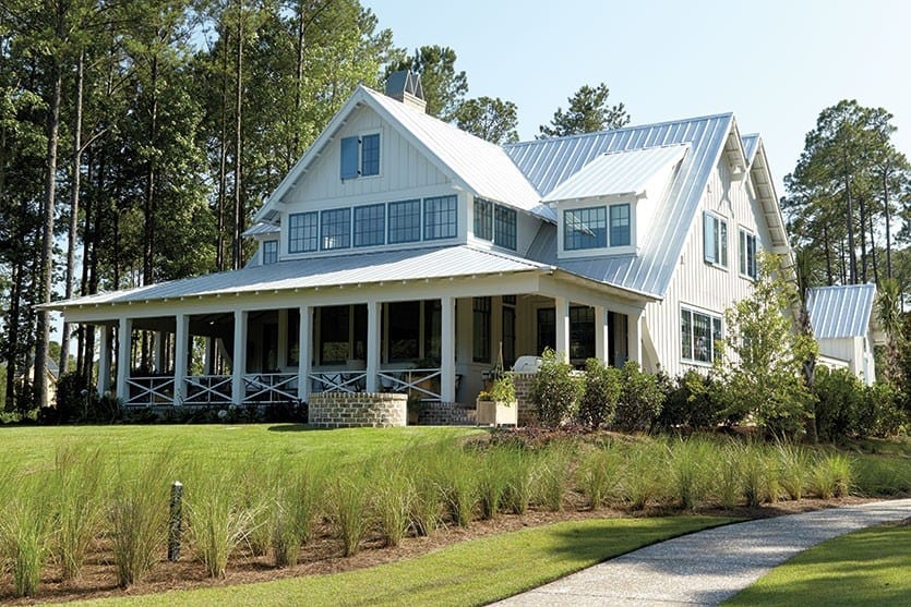
Inevitably, when the weather warms we turn our attention to the outside of our homes, sprucing up the yard and porches and generally looking for ways to turn up the curb appeal. One of the biggest exterior changes you can make for the most impact is painting your home. It’s also one of the most daunting.
To help you choose the right palette, we got in touch with color consultant and designer, Jennifer Ott of Jennifer Ott Design. “It’s good timing,” Jennifer told us when we contacted her at her office in San Francisco. “With everyone heading outside, now is the best time to paint the exterior of your house.”
Ballard Designs: How important is it to get exterior paint colors right?
Jennifer Ott: It’s pretty important. It’s much more of an effort, especially if it’s a multistory house, to repaint it. It’s more expensive and a bigger effort. It’s definitely not something you want to do on a whim and end up having to change.
BD: So when it comes to painting the exterior of a home, how many colors are we talking about?
JO: I think people tend to overdo it when it comes to exterior colors. Unless you have a very finely architecturally detailed Victorian, it’s best to limit the palette to two to three colors. And if you’ve got brick or stone or some kind of fixed element that’s not going to be painted, then that counts as a color, especially if it’s a colorful brick or stone. In that case, I would recommend using just two colors. But if your entire home is being painted — say you’ve got wood siding, trim and a front door that you want to stand out — then that is when you go up to three colors.
BD: There are so many factors that can determine a paint scheme. Where do you even start?
JO: People can get overwhelmed when they have to pick paint colors, because there are so many factors. I generally love to push clients to be creative. However, when it comes to exterior colors, I think it’s a good thing to immediately rule out some of your options. The best way to do that is to look at the architectural style of your home. If you have a Colonial or a Cape Cod, you’re going to be looking at a different palette than if you have a super modern stucco home. So start with looking at the style of your home and then those fixed elements you’re not going to change, like stone, brick or a specific color of roof.
BD: That’s a great place to start. What other factors matter?
JO: Next, I would say look at the climate that you live in. If you’re in a hot climate, you’ll want to look at lighter colors, because they absorb much less light and heat, so it’s an energy efficient choice. There’s also the neighborhood you live in, which is a huge factor. Some people live in a neighborhood where an HOA dictates the colors, which is automatically limiting right there. But if you don’t, then look around at the houses in your neighborhood. It’s not that you have to blend in or match your neighbor’s houses — I wouldn’t want people to do that — but you don’t want to veer off too far from the rest of the homes. So if you live in a neighborhood with mostly light colored homes or mostly dark colored homes and especially if you live kind of close to your neighbors, then do let that be a guide. If you’re more spread out and don’t have a lot of close neighbors, then those rules can be loosened a bit. Lastly, I’d say it comes down to colors you like. It’s pretty easy to get to a limited selection if you take all of those into account.
BD: What about environmental factors? Say you live in a wooded area. Does that matter?
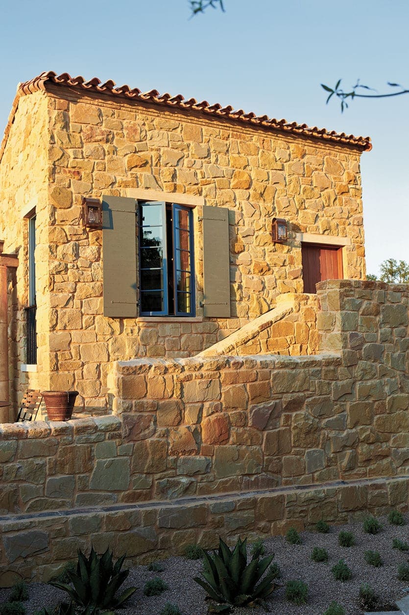
JO: If you’re in a heavily wooded area — or say you’re in Sedona, Arizona in the mountainous desert — then you’re not going to do a yellow Colonial. So the landscape and environment does make a difference. Initially, as humans began to build homes, they were made from the earth where they lived, such as clay or wood. So I think we are comfortable with our homes being a reflection of the environment we live in, because it was literally what we used to build homes. Now we’ve gotten away from that, because you can have things imported and you’re not necessarily using local materials, but there’s still something nice about having your home and the exterior colors complement the environment. So if you do live in a forest, but you don’t exactly want to blend in, pick earth tones in a lighter palette to create a bit of contrast.
BD: Are there any rules of thumb around color and the size and scale of a house?
JO: Typically, a lighter color is going to make the home look bigger and more expansive and darker colors are going to be more dramatic and make it feel smaller and more grounded. If you feel like your house is kind of dinky and you want to play it up, go with a lighter color. If you have a huge house with maybe weird proportions and there’s a section that seems a little big, you can paint it darker to make it appear smaller.
BD: Let’s go back to architectural style. How much should that guide you in your palette? Should you stick to the traditional palettes out there?
JO: Some people believe you need to stick to tried-and-true colors of the style of your home, but I’m less hung up on that. It’s more of a personal thing, but I do try to respect the style. There are some things I wouldn’t do if you have a very specific style home. Like if it’s a true Arts and Crafts home or a Tudor home, I don’t think I’d stray too far beyond the traditional palette, which you can find at paint stores. But if you’re building a modern take on a Tudor home, you have more flexibility. I have clients right now with a Tudor home, and we’re doing a light mushroom taupe color for the stucco and a cool dark brown for the timber, but I’m trying to get them to do something more interesting for the front door, like a black or a cranberry red. And that’s where you could put your own spin on it if you do the front door an interesting color.
BD: Since you mentioned it, let’s talk about the front door. Do you contrast or coordinate?
JO: I encourage people to use color to either hide elements or make them stand out. So if you have an unattractive front door, and you’re not going to change it, I wouldn’t play it up with color. But if you have a really good looking door, you can make it stand out from everything else. You want the front door to be front and center and you want to direct people to the front door. And it’s welcoming if it’s a fun color. It’s so much easier and affordable to change the front door color than the whole house color. It’s a great way to try out an accent color you really like.
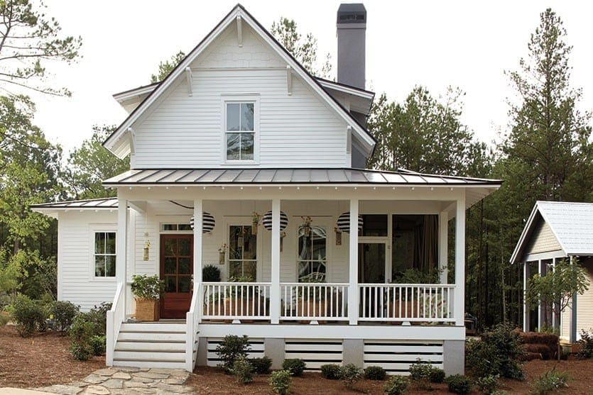
BD: Say someone wanted to go with a neutral for their home, such as white or gray? How do you choose a good white?
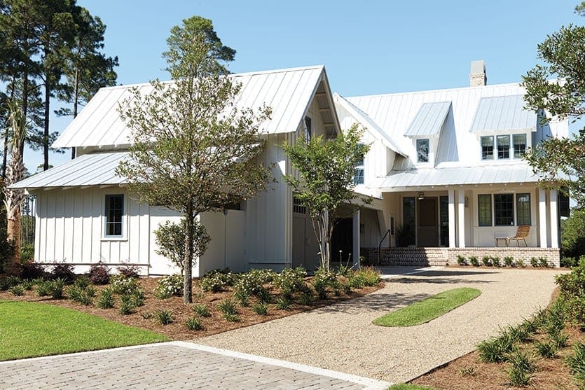
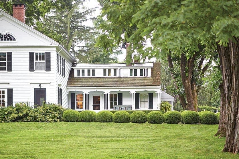
JO: White is such a safe color. I’m not anti-white — a white house can look good — but it depends on the architecture. White paints, like a white dress or pants, are unforgiving. If you see more classical architecture and it’s done well with fine craftsmanship and it’s painted a crisp white, it looks amazing. But if you’ve got an old home that’s in rougher shape, and it’s not very architecturally interesting, white just seems to show all the flaws. Color is a great way to distract from that. That being said, I pick lighter color shades of tan and gray for people for their houses all the time. It’s a matter of finding the right shade. If you go too light, it can look really washed out and if you go too dark in a warmer climate that can be a bad option.
BD: On the other end of the spectrum are those loud or quirky colors. How do you offer advice to someone who is attracted to bolder colors?
JO: I always warn people that if you’re looking at a color chip in the paint store and you really like it, you always have to evaluate that color outside on your home in the intensity of sunlight. Colors outside tend to look lighter and more saturated. Take lime green, for example. When the sun hits it, it can become almost neon. Those kinds of colors are so pure it can start to look garish and cheap. So if you like green, if you like blue, if you like orange, that’s fine, but pick colors for the exterior that have a neutral quality to them. For cooler colors, like blues and greens, make sure they have a touch of gray in them rather than selecting a pure color that might look nice on an accent wall inside your home. For warmer colors, if you’re looking at russet red, rust or orange, look for hues that have some brown in them, so they aren’t as strong. If you’re looking at two similar colors on a paint chip, I would say go with the slightly darker shade that’s more toned down. That afternoon sun really plays up the color.
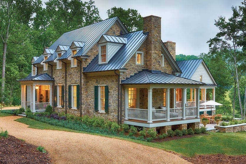
BD: That makes sense. Or maybe that’s when you play up the front door instead, as you mentioned earlier.
JO: Exactly. I often encourage people to pick a more neutral color for the body of the house and then use a crazy color for the front door. Of if you have a multilevel home with a different material on the bottom and siding up top, then the bottom section can be painted something that has a little more oomph to it and the upper level can have a more neutral color. So there are ways you can bring in more interesting and unusual colors, but I tend to discourage people to not use them as the main color for the house. Besides, those colors tend to be trendy and evolve over time and you want to commit to a color for seven to 10 years. You don’t want to have to change a color, because you’re sick of it. The exception is if it’s a really modern home with clean lines and not a lot of decorative trim and detail. If you paint it gray, it can look like a sad box. So if the architecture is clean lined and modern, you can go more crazy with the color as a focal point. You should have something that makes your house look beautiful. And if you have beautiful details and trim, you don’t need a lot of color. Of course, the Painted Lady Victorians are an exception, but those are a special category onto its own.
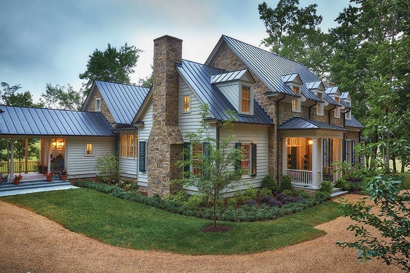
BD: Do you have any favorite go-to exterior palettes or does it vary?
JO: It varies, but I’m definitely seeing a trend now toward cooler, darker colors. Still sticking to neutrals, but beige and tan colors have had such a long run that people are reacting against that. I’m in San Francisco where there are a lot of Victorian homes, and instead of painting them in five or six different colors, people are going monochromatic with these dark, dramatic colors, like inky blues or really dark gray colors. It’s really interesting — it’s not for everyone and it can look a little Gothic, but for exteriors there are no one size fits all. I would say the best advice is to look around and figure out what you like. Look in your neighborhood at homes that are similar to yours in architectural style, and you’ll immediately pick up on things you like and don’t like. Also, look online at homes that are similar in size and style to your house and just get a sense what you like and don’t like. That can be really helpful in getting in a direction.
BD: Are there any paint colors you would absolutely warn against?
JO: I don’t know if there’s a color I would say never, ever use. Even really vibrant colors, I’ve seen them in places like New Orleans or Mexico. I would say sticking to neutrals and earth tones is a good, safe option and you can feel confident with those hues. If you’re starting to go with more colors not found in nature, that’s when you have to proceed with caution. It’s not that it won’t work at all, but it depends on how you use it, the style of your home and where you live. So just be more cautious with those colors you don’t see in nature.
BD: What if you wanted to entirely paint over a brick house — are there any tips?
JO: I don’t know if there are any rules for colors, necessarily. There are some people who say never paint brick, and I am not in that camp necessarily, but I think people should know that painting over brick could meant extra maintenance down the road. It depends on what shape the brick is in. If it’s older or crumbling, as that wears away, your paint is going to wear away with it. And it’s all about the prep work: you want to get the surface cleaned up as much as possible and all loose debris removed. And when you’re painting brick for the first time it’s best to leave it to a pro. It’s worth the extra expense. You also have to think about sheen. If you’re painting over a rougher surface you want to go satin, so stay away from a super glossy finish.
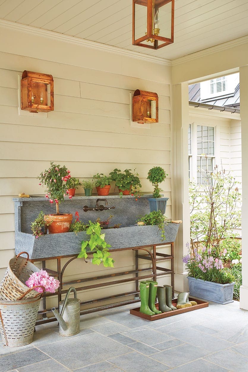
BD: What about siding?
JO: For siding people usually do flat or satin or eggshell — I use those two terms interchangeably. Typically, I like eggshell or satin because it’s a little easier to clean than flat paint. But there’s a tradeoff when you’re selecting sheen between durability and cleanability versus showing imperfections. Flat paint is great, because it covers up imperfections, but it’s not as cleanable. With high gloss paint, you can wipe it down easily, but it shows every imperfection. You have to weigh that. I say if your siding is nice and smooth, then go satin for that extra bit of durability. But if your siding is in bad shape, then you want to go flat, but it won’t be as easy to clean.
BD: Are there any common mistakes people make when painting the outside of their homes?
JO: You’ve got a lot of things on your home that you don’t necessarily want to stand out, such as downspouts, utility equipment, conduits, and other things, and I’ve seen people paint those unsightly elements in a contrasting color. But that’s when you use color to camouflage by using the same surrounding color so they blend in. In general, use restraint when picking out details to accentuate and save contrasting colors for nice architectural features or a front door. Another mistake is painting the garage door an accent color. I wouldn’t play it up. At the same time, I don’t like it when it’s painted the same color as the house, because it starts to look like this one-color, monolithic structure. My preference is to paint the garage door the trim color, so that way it’s not all one big box of color, but you’re not accentuating the garage door, either. Another trick is to paint it one or two clicks lighter or darker, and that way it breaks up the color but it’s not such a huge contrast.
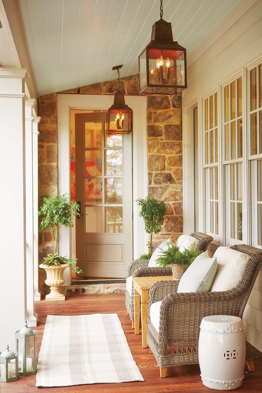
BD: Last question: In the south, we spend a lot of time on our front porches and we love the southern tradition of painting the porch ceiling blue. What color blue do you recommend?
JO: I spent some time living in Texas, so I learned about the blue porch ceiling. We actually had a client in a Victorian in Brooklyn and I encouraged him to paint his porch ceiling blue. He was from England and had never heard of it! He thought it was great, so he had this beautiful, huge front porch and we painted the ceiling in a nice medium gray-blue color. I think any sort of sky blue color looks nice. I would keep it a true blue and not a purple blue or green blue. Keep it medium to light blue, and it could have a touch of gray in it to keep it from looking unnatural or too dark of a blue.
Thanks for chatting with us, Jennifer. You gave us some great tips. Does anyone have a favorite exterior color palette?
Find our best tips on choosing paint colors, or browse paint colors from past catalogs or decorating inspiration by visiting our Pinterest boards.
Did you like this post and find it helpful? Rate it below and share your thoughts in the comments.



Karen
I enjoyed the article and the homes were beautiful, but really wish the colors of each home were provided.
Knowing that you like “THAT” photo but not knowing what the paint color is is frustrating:(.
Is there a cheat sheet which provides the colors for each photo?
Thank you!
Kendall Ryder
I love the look of white homes! I do agree that certain homes don’t look good as white. But, the white homes in the pictures look amazing. They offers such a bright and clean looking contrast to their surroundings. That is one of the reason that I love white homes!
Kathy
Can you tell me the name of the color on red door in the summer catalog
Lydia Merz
That door is painted in Sherwin Williams’ Fireworks!
judy wilson
I liked Jennifer’s advice for choosing a paint color for my house in the right shade. She’s right about how the architecture of my home determines what shade of white is right for it. My house doesn’t have that sophisticated kind of architecture, so maybe going with a darker color would be best. That would be a good way to complement the features of my house. Thanks for the tips!
Lydia Merz
Judy,
Thanks for reading! We’re glad Jennifer could give you some tips. It doesn’t hurt to be adventurous and try and a different color. Hope the painting goes well!
Marsha M.
I found this to be very helpful but wish she would have touched on roof color and how this should be incorporated in when deciding on exterior color of house.
I was disappointed that there was no discussion on roof color. My house has a hunter green roof. The house color now is in a buttercream yellow with white trim and dark green door. I would like to change color but have no idea what to do. I feel like am limited because of my roof color. Definitely don’t want to paint house white.
House is a 3 story. We are getting ready to put on market to sell so I want to make sure it is color others would be drawn to.
Caroline @ How to Decorate
Marsha,
That’s a great idea. You’re right we didn’t discuss roof color, but that does make a big difference. We’ll see if we can address that in another post.
Alisha
Great read, with awesome insight!
I laughed out loud when she describes the grey house as a “sad box”!
Here in Sacramento, CA were just getting into the dryer months, perfect for painting the exterior of our home. Rain and general humidity can really be tricky during the painting process.
Just as mentioned, I found it super beneficial to have your painting contractor paint a few swatches on; the colors really do look different in the store.
Donna W.
I enjoyed this and found that I agree with much in it. I really love the part stone house pictured here! Are plans for this house available, and, if so, where?