This post about using the color wheel for decorating was updated in May 2023.
 We know choosing a color scheme can be intimidating, but what if we told you there was a fool-proof way of creating a color palette that’s not only easy on the eyes, but one you’ll love to live with? The secret lies in the color wheel and understanding how to use it to create winning color combinations.
Color Wheel: The Basic Colors Explained
 Based on scientific color principles, the color wheel is organized in a way that shows how colors naturally combine, blend and contrast. It’s divided into 12 colors and three categories: primary, secondary and tertiary. Primary colors are red, yellow and blue. All other colors are created from these three colors.
 Between each primary color on the wheel are the secondary colors, orange, green and violet, created by mixing two primaries.
 Tertiary colors are formed by mixing a primary color with a secondary color next to it. They are yellow-orange, red-orange, red-violet, blue-violet, blue-green and yellow-green.
Color Schemes from the Color Wheel
The color wheel is an essential decorating tool as long as you know how to use it. Color is a huge tool when decorating your space — it can evoke a feeling you’re looking to create, it camouflages flaws, creates drama, creates serenity, and will help your eye move around the room. Below, we outline different color palettes, why you might want to use them in your room, and how we used the color wheel to create them.
Keep in mind: blues, greens and purples tend to be cooler tones that are more calming, and oranges, yellows, browns, reds and pinks are warmer tones that are more exciting. Before you pick a color palette, it’s important that you know what kind of feel you want in your room.
Monochromatic Colors
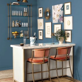
Nothing says you have to decorate with a medley of colors. In fact, going monochromatic with tone-on-tone color can result in a really sophisticated, edited look.
Start with a color you really love (for a good starting point, think about what color you wear the most), then have fun with mixing varying shades, from light to dark, or keep it classic by sticking to one shade. Everything is fair game, from the walls to upholstery to accessories.
 Generally, a well-balanced room has both cool tones and warm tones, but not necessarily in equal amounts. So if you have a monochromatic color scheme with a cool tone, warm it up a bit with a natural fiber rug, wood furniture and brass, black or oil-rubbed bronze finishes. Conversely, anchor a warm palette with white walls and neutral upholstery.
Analogous Colors
If you like the simplicity of the monochromatic color scheme, but want more interest, the analogous color scheme is for you.An analogous color palette uses two to three colors that are side by side on the color wheel. It’s a no-fail way of creating a successful color combination with a mild contrast.
The best way to create a cohesive look is to follow the 60-30-10 rule — 60 percent dominant color, 30 percent secondary color and 10 percent accent color. To create a more relaxing vibe in a space, such as a bedroom, choose muted hues or cool tones. For a more energetic feel, go for more saturated hues or warm tones.

A popular analogous color combination, and one we particularly love, is blue and green. You can go either way on the wheel to introduce a third color with yellow or violet. Even adding just one thing, such as a painting or an upholstered chair, in that third color adds excitement.
Most popular analogous color palettes:
- Blue and green — combining blue and green is a timeless choice, even Mother Nature agrees. Shades of blue and green work beautifully together because their cool tones are serene.
- Yellow and green — Green is a classic choice, but we love to amp it up with yellow by balancing the cool with the warm. Both are colors found heavily in nature, so you know this combination will never go out of style.
- Blue and purple — While purple is technically a cool tone, it has red in it which warms it up. Purple in any shade is a great accent to blue because it helps balance the coolness.
- Red and orange — If you’re looking for drama, use accents of red and orange in your space. Both of these colors are energizing and excellent choices for rooms that you want to feel upbeat and dramatic.
Complementary Colors
As they say, opposites attract. Complementary colors on the color wheel are colors that are across from each other. Choosing two complementary colors creates an energizing, high-contrast color scheme. It’s also a pretty simple concept: pair two colors from opposite sides of the color wheel, such as purple with yellow, blue with orange or red with green.
 Obviously, you’ll want to look beyond the primary colors to create that winning combination of just the right shades.
 For example, invigorate a room with spa blue and a touch of pink, go global with aubergine and saffron or freshen up with raspberry and lime green. When we use two contrasting, vivid colors, we like to favor one color over the other, or use both of them for accents against a neutral background. A healthy dose of white and plenty of natural light never hurts!
Triad Color Scheme
Feeling adventurous? A triad color scheme is made up of any three colors evenly spaced on the wheel. This color scheme creates a vivid contrast, but it’s balanced, so it feels a little less intense than a complementary color scheme. Make it easy on the eyes, and let one color dominate and accent with the other two. If you really want to go bold, use saturated versions of all three colors, or soften the colors and incorporate plenty of neutrals.
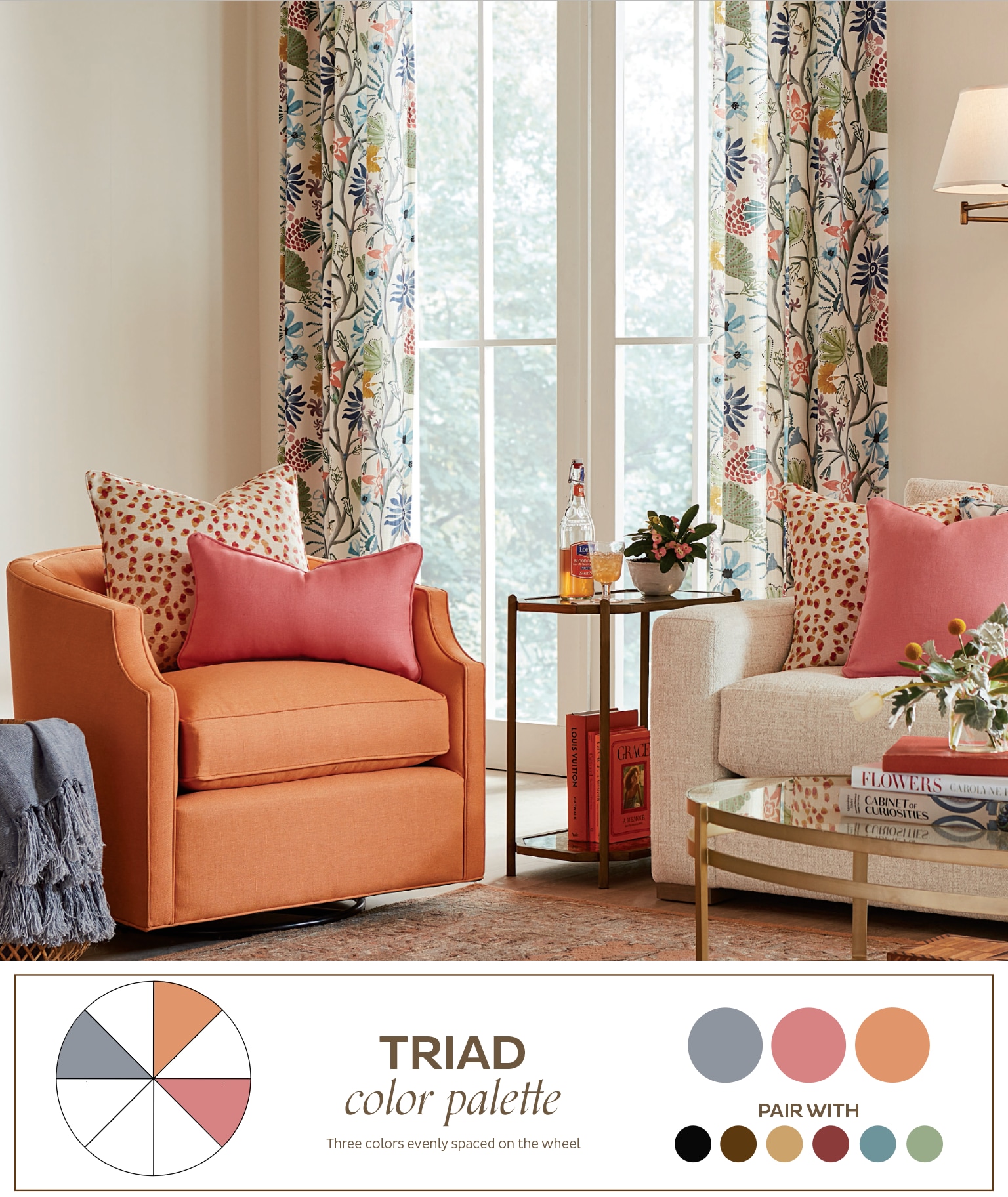 Want to learn more about decorating with color? Find all of the colors we’ve used in our rooms. Learn more with these blogposts:
- Colorful Rooms: How to Add Color to Every Space
- Small Ways to Add Color to Your Room
- Jewel Tones – How to Love Them in Your Interior Design
- How to Pick Paint Colors for Your Room
- Decorating with Dark Paint Colors
To stay up to date with all things How to Decorate, sign up for our monthly newsletter or subscribe to our podcast, How to Decorate, in your podcast app.


Giani Mihalek
Can you please explain how you chose the “pair with” colors. What’s the strategy and technique there?
Mallory Thomas
Giani,
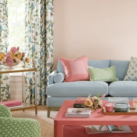
Good question! It’s important to remember that there is no “right” color palette, rather there are several variations and combinations of colors that can give you that balanced, cohesive look. In the case of our monotone pink color palette, we chose to pair our pinks with pops of green. Red and green are complementary colors, which are great for making things stand out and adding contrast. The “pair with” colors can also help establish the feel of a room. For example, we chose muted colors for our first analogous color palette to create a more relaxing vibe. You’ll also notice that we included a few neutral colors within all of our palettes. Neutrals can help anchor the palette and balance out all of the color. Finally, we all have our own color preferences, so don’t be afraid to mix and match colors until you find what looks best to you!
Happy decorating!
Mallory
Laura
This is a great article! It would be so helpful to see the photos, but like others have commented, all I see is a white box. Can this be fixed?
Caroline McDonald
Hey Laura,
We’ve updated this post with the images. I hope you find it helpful!
Caroline
Cleopatra Y McCormick
I am trying to revamp my 3 bedroom, 3 bath house. I am changing carpets, tile, kitchen cabinets, bedroom furniture, bathrooms and paint etc… I love warm colors but i’m stomped on what colors i should paint the living room and bedrooms. I wish I could afford an interior designers…Can someone please help me?
Abbey Nolte
Hi Cleopatra,
We actually have a team of free interior designers who would love to help you figure out your decorating dilemma. Simply upload images of your room and your question here.
Abbey
mary
I don’t see any images with this article, but there are blank boxes with a question mark in them indicating an image. How do I see the images? This is a GREAT article on using the color wheel. Thanks for any help!
Abbey Nolte
Hi Mary,
Thank you for pointing this out for us. We will work to get it fixed!
Abbey
Annette
The images are not visible on this page. Can you please correct this?
Abbey Nolte
Hi Annette,
Thank you for pointing this out for us. We will work to get it fixed!
Abbey
rachelle randall
Hello,
I painted my family room a rich red and mustard. I think the room is stunning! However, I am not sure what colors to paint the adjouning rooms…the living room and the kitchen. As I understand color cohension, I need to incorporate a balance of warm and cool colors. Please help!
Abbey Nolte
Hi Rachelle,
We have a team of interior designers who would love to help you figure out your decorating dilemma. Simply upload images of your room and your question here.
Abbey
Anne
I have two ochre coloured sofa’s (not beige or yellow, but a mix of both). I want to revamp my living room but i’m At a loss as to what colour to use for new curtains and cushions. At the moment it has a combination of duck egg and cream, but I feel it is too bland. What would you suggest?
Anne
Caroline McDonald
Anne,
It’s hard to make a suggestion without seeing photos of your space, but we do offer free design services in our stores and online. They’d be able to look at the colors of your furniture and make appropriate suggestions. You can sign up for an email or online consultation here: https://www.ballarddesigns.com/design-solutions/content
Best of luck!
Caroline
Yael Wiesner
My living room/dining room (one room) is a combination of cherry wood bookcases and table& chairs, a light grey L-shaped couch and creme colored walls. The colors don’t clash, but they don’t blend nicely either. I’m not buying new furniture, but is there a specific color or pattern which can bring all these colors together to give an inviting look? Thanks for your help
Caroline McDonald
Yael,
We actually free design services in our stores, online, and by phone. Sign up for a consultation here. They can help you find art and accessories to pull everything together!
Good luck!
Virginia
I would like to start the New Year with redoing and decorating my office. I like the Old world craftsman with modern furniture look with light colors to make the room light with darker furniture. I like green, beige, white, and yellow, I’m not really sure where to begin but don’t want to make costly mistakes. I desperately need help with decorating and decor, I want to start with the right color scheme.
Caroline McDonald
Virginia,
Send our interior designers your space and they can come up with a plan for you! We offer a free service in our stores and online via this form. Simply submit your question and photos, and we’ll reach out with a plan and furniture suggestions.
McKenzie
I love all of the great decorating advice! In this post you show colors that pair well with each scheme. How did you choose these colors? What is the trick? Thanks!
Jean Ehlke
Very interesting
Cheryl
Hi. Our house is a large 2 story home by the beach it is mostly white with a light grey trim along the roof . We are struggling with a colour for our long wooden fence. We have a contemporary coastal theme. We have charcoal coloured pavers throuout the gardens and against the White House
I love the colour of a subtle blue but not sure if that would work for an exterior fence we are considering white but not sure if that will be too much white. Can you please help?
Thank you cheryl
Caroline @ How to Decorate
Hi Cheryl,
We actually offer free design services that can help you with your space. They’d be happy to make some paint color suggestions for you. Simply complete this form and our Design Solutions team will reach out to you. Be sure to include photos of your space so we can give you the most helpful advice and tips!
The How to Decorate Team