

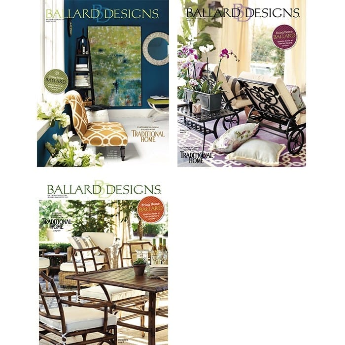
Providing the paint colors used in Ballard Designs catalogs can be difficult, because we constantly shoot at actual homes that have been painted by their owners. However, our team of stylists has chosen paint colors that are as close to the actual wall colors as we could find. These colors will blend with our furniture, accessories and fabric.
As with any paint, various light conditions can affect how the color will look in your environment. We recommend purchasing a small paint sample. Paint a large square, let it dry and look at it in both the day and at night (paint color changes as light changes). This method is inexpensive and will save you from making a much bigger and more expensive mistake. Also note that printed colors will not match paint chips exactly, so always try a sample on your wall before you start your project. For simplicity, we use Benjamin Moore paint matches. Most paint stores are happy to match any color that you bring them.
We hope that you enjoy reviewing the colors chosen. We think the colors will give you a great background for your Ballard Look.

Related: How to Paint a Room

Troy Body
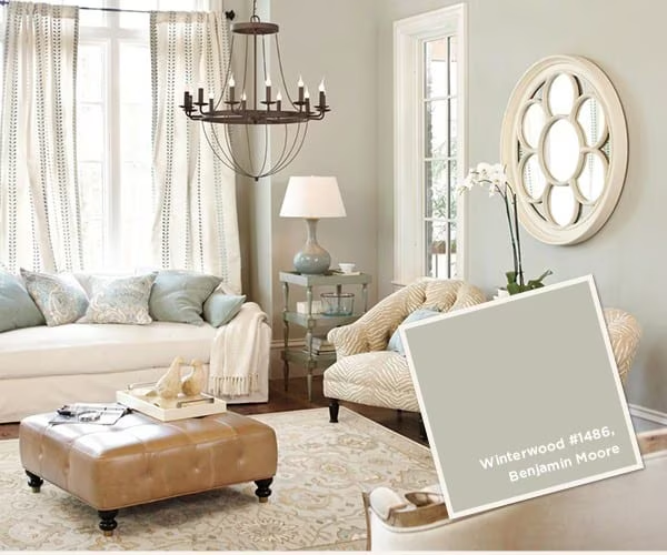
I need a good accent wall color for winterwood. It is for a small 1,000 sq ft house without a lot of light. Any suggestions?
jamie willard
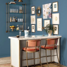
can you give any info on the ceiling light fixture? Thanks!
Caroline @ How to Decorate
Hi Jamie,
Which light fixture are you interested in? All light fixtures in these rooms are from Ballard Designs.
We hope this helps!
The How to Decorate Team
Heather Carraway
Hi! Do you guys still carry that leather ottoman, by chance?
Caroline @ How to Decorate
Hi Heather,
Thanks for your comment. Unfortunately we no longer carry that particular ottoman. I’m so sorry! We do offer several similar styles though.
The How to Decorate Team
Meredith Klein
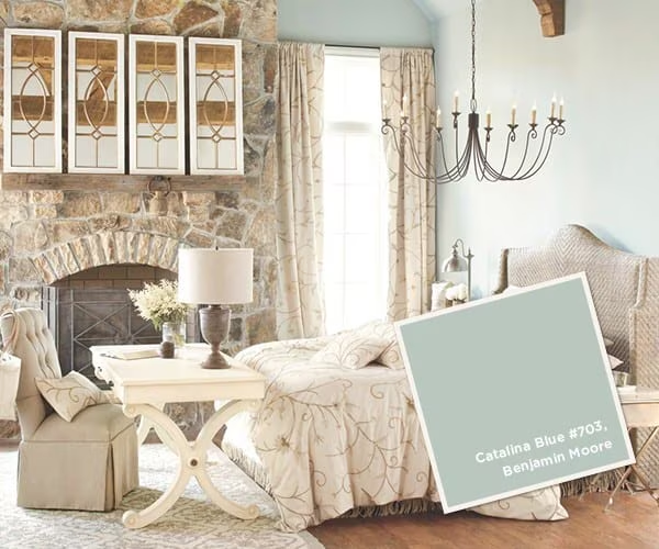
Just received my January 2015 catalog and love the color on page 6 behind the Edward Potthast picture, which I have in my living room. Is that color the Catalina blue? I love that soft greyish blue.
Caroline @ How to Decorate
Hi Meredith,
Thanks for your comment. The color behind the Edward Potthast painting on page 6 is Benjamin Moore’s Wedgewood Gray #HC-146.
Hope that helps!
The How to Decorate Team
Cassie
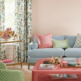
do you carry the curtains in the second picture?
Caroline @ How to Decorate
Hi Cassie,
Thanks for your comment. Unfortunately, we no longer carry those curtains panels, but we do carry lots of similar curtain panels which you can browse here.
Best of Luck!
The How to Decorate Team
Jessica
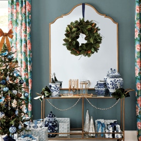
Can anyone tell me where to find that white flower mirror in the second picture?
Caroline @ How to Decorate
Hi Jessica,
Unfortunately the mirror you’re wondering about is a style we no longer carry. I’m so sorry! But, we do a one that is pretty similar, our Entwined Fleur de Lis Mirror. Our Suzanne Kasler Bone Sunburst Mirror and Crown Sunburst Mirror could also work.
Best of Luck,
The How to Decorate Team
Bethany
Is “Varsity Blues” the same color used on the catalog cover? I’m absolutely enamored by it and want to use it in my front room. Anxiously waiting! 🙂
Karen
Rita,
You are correct. It is indeed Scenic Drive by Benjamin Moore.
Rita
Is the paint shade on pages 12 and 13 of your early spring catalog “Scenic Drive” #697 by Benjamin Moore? Please confirm, thanks!
Karen
Rita, You are correct. It is indeed Scenic Drive by Benjamin Moore.